Counter Fill: colouring the holes in your type

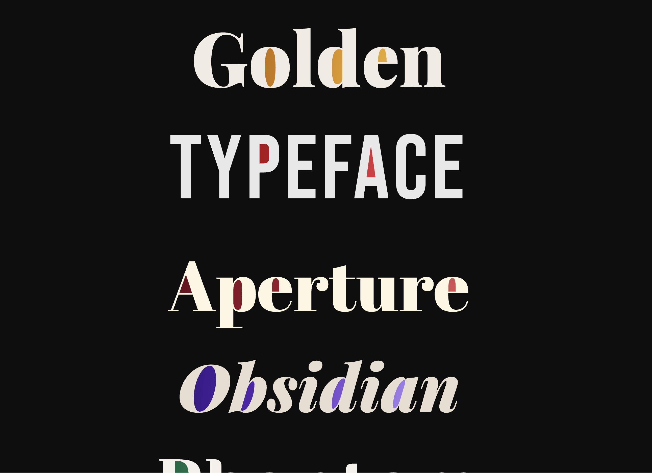
Filling the counter — the enclosed space inside a letter like the bowl of an o — is a standard design move in print. On the web, on live text, the options have been thin: export the type as an image and lose accessibility, or hand-draw SVG paths for one font at one size. Counter Fill is a small JavaScript library I built to do it on live DOM text, at any font and any size. The Usage section has what you need to drop it into a project. How it works walks through the approach.
The counter as a design detail
The counter is the enclosed space inside a letterform: the bowl of an o, the eye of an e, the aperture of a p. Type designers have shaped and tuned these spaces for centuries. In display type, they carry as much visual weight as the strokes themselves.
In print and in design tools, filling a counter with a contrasting colour is a standard technique. Editorial mastheads, logotypes, concert posters — designers reach for it whenever type is being treated as image rather than content.
I work on both sides of that gap. When you design something and then have to build it yourself, you end up with a running list of techniques that exist in print but have no browser equivalent, and counter fills were on my list for a long time.
Why the workarounds fall short
The existing options are all compromises. SVG paths drawn by hand require redrawing for every font change and fall apart the moment you scale or reflow. CSS blend mode tricks depend on the background being a specific colour and break on anything textured or dark. Image exports throw away accessibility entirely: the text becomes unpickable, unsearchable, invisible to screen readers.
The constraint I set: real DOM text, any font, any size, accessible. No pre-baked paths. No images. Nothing hardcoded to a specific letterform.
Usage
Counter Fill is a small JavaScript library that detects the enclosed spaces inside letterforms and fills them with colour or gradient. It works on live DOM text, with any font, at any size. Install it from npm or grab the script directly. Required CSS is injected automatically, so no stylesheet is needed.
npm install @jacquesramphal/counter-fill
Single-line
<h1 class="wrap" id="w1">
  <canvas></canvas>
  <span class="text">Golden</span>
</h1>

<script src="counter-fill.js"></script>
<script>
  document.fonts.ready.then(() => {
    CounterFill.init({
      w1: { stops: ['#f5c842', '#d4820a', '#7a3a08'] },
    });
  });
</script>
Multi-line
Just write the text. The library splits words automatically.
<h2 class="wrap-multi" id="wm">Golden Baroque Obsidian</h2>

<script>
  document.fonts.ready.then(() => {
    CounterFill.init({
      wm: { stops: ['#f5c842', '#d4820a'] },
    });
  });
</script>
Fill config
Two or more stops become a radial gradient from the centre out. One stop is a solid fill. CSS custom properties resolve at paint time, so design tokens work directly.
CounterFill.init({
  w1: { stops: ['#f5c842', '#d4820a', '#7a3a08'] }, // 3-stop gradient
  w2: { stops: ['#60c8f0', '#002060'] },             // 2-stop
  w3: { stops: ['#e05c5c'] },                        // solid
  w4: { stops: ['var(--color-accent)'] },            // design token
});
For Vue, React, and module setups, see the full README on GitHub.
How it works
Counter Fill uses Canvas 2D as a rendering surface. It draws the text onto an offscreen canvas, then runs a BFS flood-fill from every edge pixel. Any transparent pixel the flood can reach from the edge is outside the letterforms. Any transparent pixel it can’t reach is enclosed — a counter.
The canvas doesn’t need bezier paths or letterform outlines. It just needs to know which pixels are ink and which are air, which the browser’s Canvas 2D context already knows.
Three details make it work reliably in production rather than just in a demo:
Baseline alignment. The Canvas textBaseline and DOM layout don’t agree precisely. A probe canvas measures where the ink actually lands, compares it against the expected position, and corrects the offset before drawing. Without this, fills drift at specific screen densities and across browsers.
Dilation. Counter pixels are expanded 2px outward before painting to close antialiasing gaps at stroke edges. The text span sits above the canvas via z-index, so any bleed is covered by the strokes themselves.
Multi-line. In multi-line mode, each word gets its own canvas, measured by a zero-width baseline probe span. The gradient stays coherent across line breaks because all word canvases share the same gradient origin.
One side effect of the BFS approach: it generalises to any enclosed region, not just the counters you’d expect. Letters with unusual or large counter shapes work without any special handling.
Variable fonts
Variable fonts add a layer of complexity. The canvas has to match a glyph that may be at a custom wght, wdth, or any proprietary axis, and Canvas 2D historically didn’t support those axes natively.
Counter Fill selects from three rendering paths automatically:
- SVG embedded-font: the font file is fetched, base64-encoded, and embedded in an SVG
<text>element drawn to canvas. This supports all axes including custom ones likeSOFTorGRAD. It’s the most accurate path and works in all modern browsers. ctx.fontVariationSettings: Chrome 134+ added native canvas support for variation settings. When available, this path is used directly.- Canvas fallback:
wghtmaps to font-weight,wdthmaps to font-stretch keywords with a width-scaling correction pass. Works everywhere; doesn’t support custom axes.
Safari’s SVG engine partially applies font-variation-settings. Standard axes (wght, wdth) work via their CSS property equivalents, but custom axes like SOFT may not render pixel-identically to Chrome. Fills on Safari use increased dilation and textLength for alignment.
Results vary at extreme weight values and with custom axes. At very heavy weights (800–900+), counter openings become small enough that the fill may not appear, or may appear slightly misaligned depending on the browser and screen density. Standard axes on Chrome and Firefox are the most reliable. Safari handles standard axes but may not render custom axes, which can cause fills to drift from the visible glyph shape. If a demo below appears without fills on first load, resizing the browser window triggers a repaint that usually resolves it.
Fonts are auto-detected from Google Fonts <link> tags and same-origin @font-face rules. Cross-origin fonts and fonts loaded via JavaScript need to be registered manually:
// Register before calling init()
await CounterFill.registerFont('My Font', '/fonts/my-font.woff2');
await CounterFill.registerFont('My Font', '/fonts/my-font-italic.woff2', { style: 'italic', weight: '700' });
wght × wdth (Roboto Flex)
Custom axis — SOFT (Fraunces)
A few things worth knowing
Letter-spacing
ctx.letterSpacing is supported in Chrome 99+, Firefox 116+, and Safari 17.2+. On older browsers without it, fills still render but may drift slightly on text with non-zero letter-spacing.
Text-shadow
CSS text-shadow doesn’t carry into the canvas context, so the fill mask is always clean regardless of what shadows are set on the DOM text. The shadow renders on top of the canvas exactly as it would without the fill.
Line-height
Multi-line mode splits words into per-word canvases. Line-height affects the spacing between those canvases, not the fill detection. The BFS region filter also rejects the flat gaps between words as false positives, so tight or loose leading doesn’t produce spurious fills.
Canvas content doesn’t print by default, but Chrome renders it correctly. For other browsers, a @media print CSS fallback keeps the text legible:
@media print {
  .wrap canvas { display: none; }
}
More elaborate print fallbacks, like restoring a CSS background or outline effect, are possible but aren’t built into the library. Firefox and Safari don’t render canvas content in print at all, so the @media print rule above is recommended for cross-browser print support.
Writing modes
Canvas fillText renders horizontally only, so vertical writing modes (vertical-rl, vertical-lr) use the SVG embedded-font rendering path. The font is fetched, base64-encoded, and drawn as SVG <text> with writing-mode set, then painted to canvas for BFS detection. RTL direction works natively since the shaping engine handles bidi within horizontal rendering.
Performance
The expensive operation is getImageData, reading pixel data back from the GPU. For a 140px heading at 2× DPR, that’s about 156,000 pixels and runs in under 1ms on modern hardware. BFS is O(pixels) with comparable cost.
Resize handling stays cheap through three things:
- A
WeakMapsize cache skips elements whose pixel dimensions haven’t changed - Repaints are debounced via double
requestAnimationFrame, batching all resize events into a single pass - Font files are fetched once at init and reused for every subsequent paint
Paint only happens on init and on resize. There’s no continuous loop.
What I learned
The hardest part had nothing to do with the fill algorithm. Making Canvas and the DOM agree on where text actually sits took longer than everything else. They have independent layout engines that disagree in ways that only show up at specific screen densities, specific fonts, and specific letter-spacing values. The drift correction pass was necessary from the start.
If you work on both the design and the code, you know what it’s like to find a technique that exists everywhere except the browser. Some of those gaps are hard for good reasons. This one turned out to be solvable with a flood fill.